

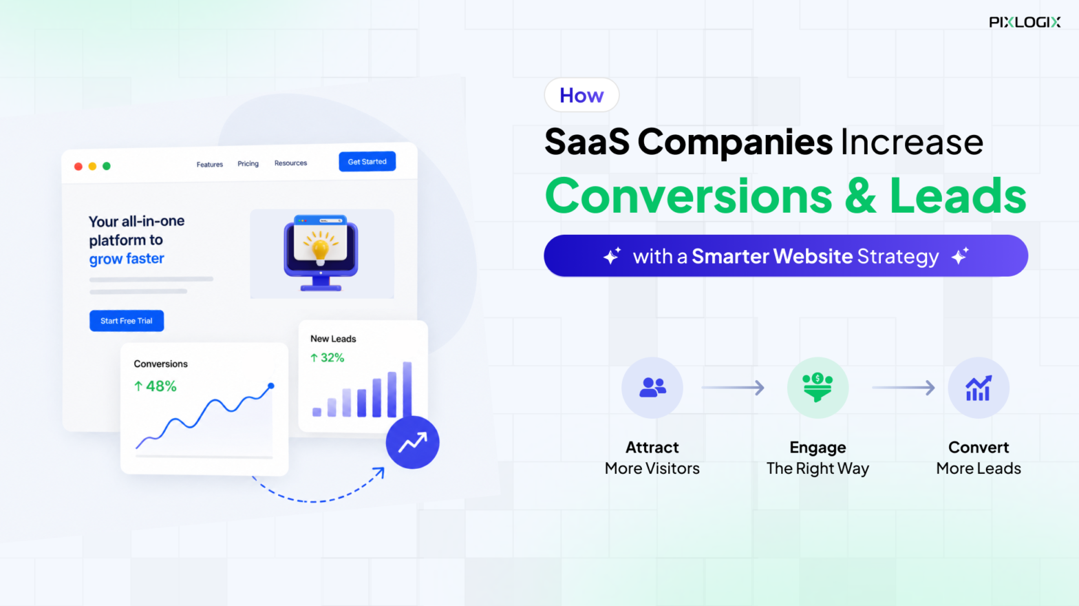
Have you ever landed on a confusing SaaS product website? And then closed the tab because nothing felt clear? No obvious value, no trust signals, and no direction. That silent exit is where SaaS website design loses revenue.
A high-converting SaaS website is not built on sleek visuals. It is engineered with clarity, trust, and psychology. The essentials include value clarity, where messaging instantly communicates the “why”. Trust signals like compliance badges. And seamless UI/UX flow with frictionless navigation.
The best SaaS homepage design integrates personalization, tailoring experiences to user segments. They also emphasize speed and accessibility. Because even a one-second delay can reduce SaaS website conversion by up to 7%, together. They can transform a SaaS website from a static brochure into a dynamic growth engine.
Recent industry benchmarks revealed these insights. An average SaaS site converts only 2 to 3% of visitors. But top performers achieve 10-15% visitor-to-trial conversions. And 20-40% paid-to-trial conversions. This proves that optimization directly impacts revenue growth.
In this blog, let’s explore the essential levers behind lead generation for SaaS websites. This breakdown will show you how modern SaaS websites turn visitors into loyal customers–with strategies you can apply today.
The Core Rule of SaaS Conversions: Clarity Beats Creativity
Most teams try to be clever. But a high-converting SaaS website tries to be clear.
Visitors decide in just 3 to 7 seconds. So, if the SaaS landing page optimization isn’t obvious, they disengage. This creates friction in the SaaS user experience. Not because the product is weak. But the message is unclear. Poor clarity creates friction in the SaaS user experience. And this friction directly reduces action.
Strong SaaS landing page optimization starts above the fold. Your headline should state the outcome. Your sub headline should identify the user and context. Your CTA should define the next step. This is a core rule across SaaS website best practices.
A professionally optimized website ensures:
- Above-the-fold clarity. For example, what, who, and the result.
- Single-focused CTA.
- Fast load speed and mobile readiness.
- Clear visual hierarchy.
- Instant trust and compliance signals.
Quick takeaway: Clarity is not just design–it’s a conversion strategy. Creativity may impress, but clarity converts.
Why Most SaaS Websites Don’t Convert?
Even a technically strong SaaS website design can fail at conversion. This happens when messaging and structure are weak. Overall, visitors cannot quickly understand the product’s value, relevance, and next step.
The most common SaaS website conversion killers include:
- Feature-first instead of benefit-first copy.
- No industry-specific positioning.
- Too many competing CTAs.
- No proof or validation.
- Slow load times.
- Poor mobile responsiveness.
- Confusing homepage hierarchy.
- No clear lead generation strategy.
For example, a healthcare platform highlighted all the technical features in their SaaS product website. They included HIPAA modules, API layers, and encryption protocols. While these are important, they fail to connect with the user’s immediate needs.
So, a strong approach would be–“Book secure virtual consultations in under two clicks–fully HIPAA compliant.” This phrasing shifts from technical jargon to a clear benefit. And also, it resonates with both patients and providers.
Quick takeaway: Features inform, but outcomes convert. Clarity in messaging and structure is the real lead generation for SaaS websites.
The Key Elements of a High-Converting SaaS Website
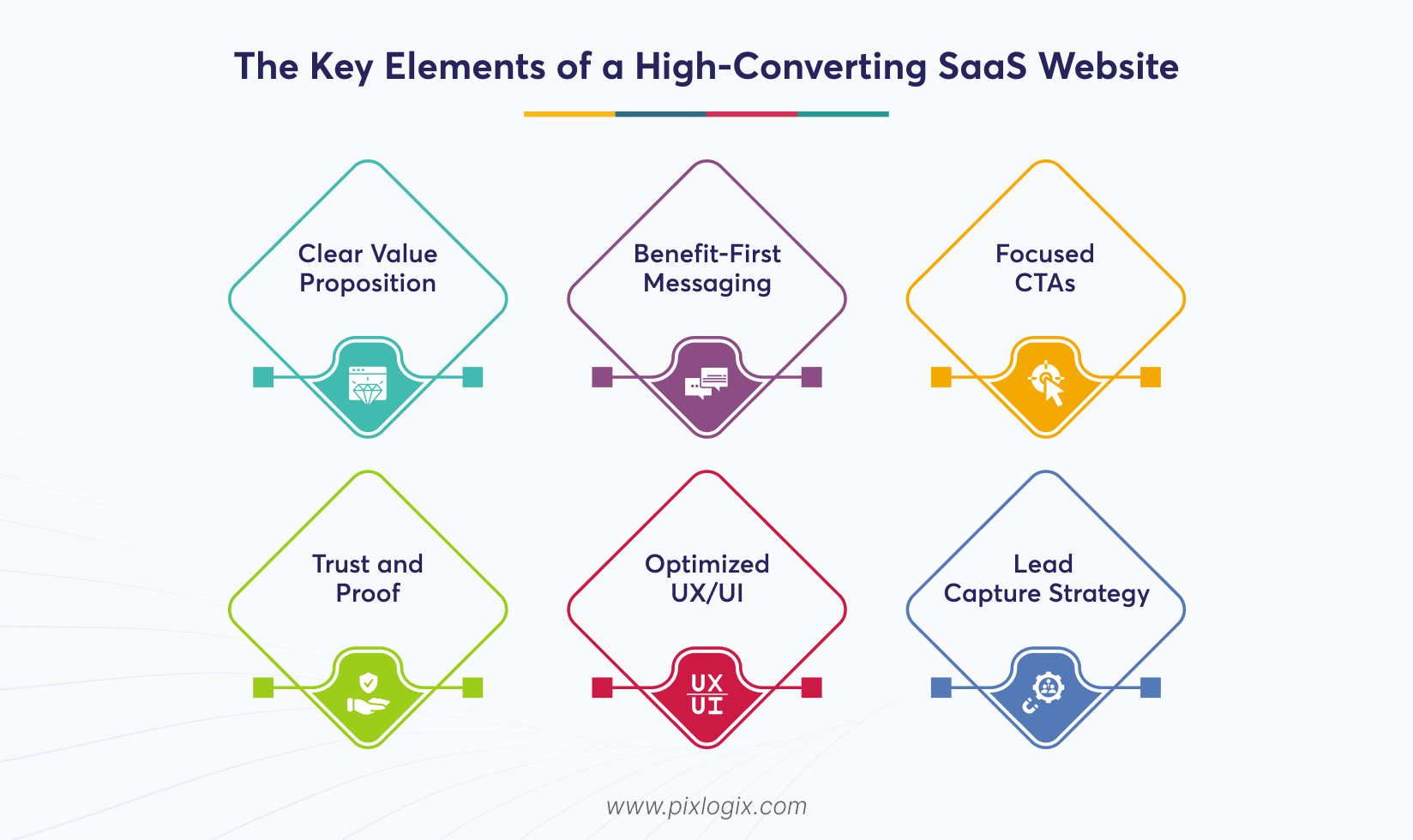
A SaaS website isn’t just a digital brochure. It’s the front line of customer acquisition. To convert visitors, every element must work together. Let’s see those key drivers in detail:
Clear Value Proposition
Your headline should instantly communicate the core benefit. Visitors must know what the product does within seconds.
Benefit-First Messaging
Features explain, but benefits persuade. Frame technical capabilities in terms of outcomes. This includes faster workflows, reduced costs, and improved compliance.
Focused CTAs
Calls-to-action should be simple. One clear path reduces decision fatigue. For example, “Start for Free” or “Book Now”.
Trust and Proof
Regulatory trust signals are essential for a B2B SaaS design. So, include your client testimonials, recognizable logos, and case studies. Also, add your compliance badges, which fuel confidence.
Optimized UX/UI
Your site should be fast and responsive. It ensures that users don’t drop off. An optimized website has intuitive navigation. This guides user attention without clutter.
Lead Capture Strategy
Keep forms, gated resources, and demo scheduling tools frictionless. This ensures that interest translates into pipeline growth.
Quick takeaway: A high-converting SaaS website must keep its users first. Every element should reduce friction and highlight outcomes. This makes conversion follow naturally.
How Design Impacts SaaS Conversions (More Than You Think)?
Good B2B SaaS design is navigation psychology. Every design choice either reduces or increases mental load. It also directly impacts whether a visitor converts. A strong SaaS user experience guides attention and simplifies decisions. It also builds trust without the user even realizing it.
Conversion-Centered SaaS Website Design Includes:
- Visual hierarchy: Include the best headlines and CTAs.
- White space: This makes content digestible.
- Consistent colour cues for CTAs: Guide users to instantly recognize the action path.
- Scannable layout: Use short content blocks and clear headings.
- Mobile-first responsiveness: Poor mobile design costs conversions.
Design is not just about looking modern. It’s about shaping behavior. When the layout aligns with user psychology, conversions rise naturally.
Quick takeaway: SaaS design is a strategy in disguise. It reduces friction and turns interest into action.
Signs Your SaaS Website Is Hurting Growth
Many SaaS teams pour resources into ads and outreach. But they ignore the friction hidden in their website. Your site should communicate value clearly and guide users smoothly. If not, growth stalls–no matter how much traffic you drive.
Warning signals include:
- High traffic but low demo bookings. Here, visitors arrive but don’t convert.
- Bounce rate above 65%. This signals unclear messaging or poor UX, where users leave quickly.
- Long pages with low scroll depth. In such sites, content feels overwhelming or irrelevant.
- Multiple competing CTAs. Too many choices create confusion instead of action.
- No segmentation for buyer roles.
- No proof sections. This includes missing testimonials, compliance badges, or recognizable client logos.
- Generic templates. Such cookie-cutter SaaS designs are not credible.
Quick takeaway: Your SaaS site shouldn’t be confusing or generic. These warning signs act as growth blockers.
Turning Your SaaS Website into a Growth Engine
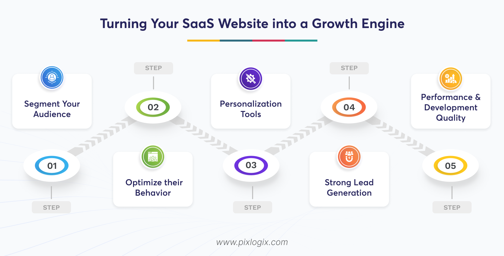
Conversion is not guesswork in its system design. A SaaS website becomes a growth engine when every element is engineered properly. It should reduce friction, build trust, and guide users toward action. Let’s look at how to transform your simple SaaS website into a growth generator:
Step 1: Segment Your Audience
First, analyze who you are serving. For example, healthcare, IT teams, etc. Then, tailor your message and landing pages accordingly. So, it speaks directly to their priorities.
Step 2: Optimize their Behavior
Use technical tools to identify where users drop off. This includes funnel tracking and heat maps.
Step 3: Personalization Tools
Modern SaaS platforms adapt to all visitors. They connect seamlessly, even if they have dynamic content and behavioral triggers. Pages that shift based on user type create relevance. This reduces decision fatigue.
Step 4: Strong Lead Generation
SaaS buyers prefer low-risk entry points. Make use of ROI calculators, compliance checklists, and demo videos. They help convert better than generic eBooks.
Step 5: Performance & Development Quality
Ensure your site has accessibility standards and scalable architecture. They support conversion goals.
Quick takeaway: A SaaS website can act as a growth engine. But only when segmentation and personalization to achieve technical excellence.
Conclusion
SaaS website conversion happens only when every element works toward one goal. They must reduce doubt and increase decision confidence. Clear outcome-driven messaging creates immediate relevance. Also, focused CTAs, strong trust signals, and structured SaaS website design are crucial here. High-performing SaaS websites replace feature-heavy noise. Instead, they bring benefit-first clarity. They also ensure a frictionless SaaS user experience. Data-backed optimization and personalization further strengthen results. In short, conversion is not a design luck. It is engineered clarity, guided flow, and measurable trust in action.
Want to create a results-driven SaaS website? Then partner with a leading web development company that turns visits into qualified leads, such as Pixlogix. We offer conversion-driven web development services in India. It will help your brand grow digitally faster. Our experts optimize your page, improve UX, and fine-tune technical performance. Contact us today! We’ll help you transform your website into a revenue channel.
Written by Samir Bhimbha Founder & CEO
Samir Bhimbha is the Founder & CEO of Pixlogix Infotech Pvt. Ltd. which offers web and app solutions to fulfill business's online needs and help to improve their online presence with many clients in the USA, Europe, Australia, and more. He is a skilled entrepreneur, web designer, developer, and team leader who can handle every situation. With 15+ years of experience in UX/UI design and web development, he is leading a team of IT professional talents.
Related Post

Get in Touch Now!
Have a word with our expert consultants about your next project to get suggestive guidance & proposal.
Sales Inquiry
HR Inquiry
![]() India’s First SOTD Winner on Awwwards.com – 2010
India’s First SOTD Winner on Awwwards.com – 2010