
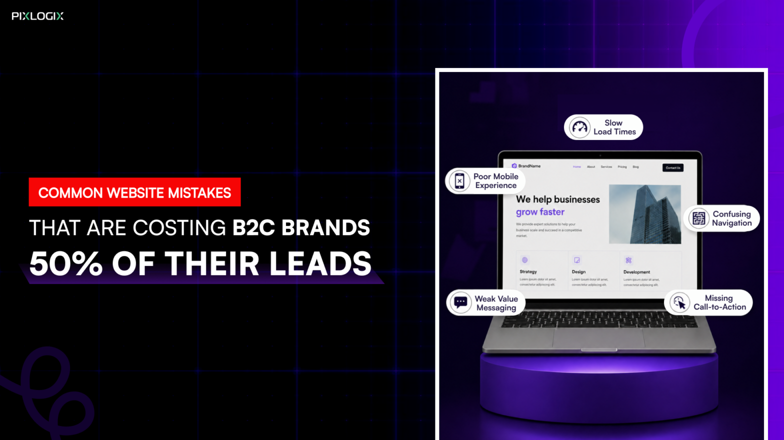
What if half the leads your B2C brand could generate are quietly slipping away? Not because of weak marketing. But because of common website mistakes.
Your website isn’t just an online brochure. It’s your full-time salesperson. In today’s B2C world, buyers are impatient, mobile-first, and comparison-driven. Even the smallest B2C website optimization mistakes can cost you conversions. Recent studies show users form an opinion in just 50 milliseconds. And over 53% of mobile users leave faster. It’s because the site takes more than 3 seconds to load. This is how conversion optimization mistakes cost leads.
But performance alone isn’t the problem anymore. Beyond speed and design, issues like poor accessibility also affect conversions. Lack of data transparency and missing trust elements silently drive users away.
Many brands focus on driving clicks through ads and campaigns. But traffic doesn’t equal conversions. And they ask: Why is my website not generating leads? They spent more on grabbing visitors’ attention. But failed to notice the B2C website lead loss reasons.
Now thinking–how to navigate these website mistakes that hurt conversions? Then read this blog. We’ll break down the reasons websites fail to convert. By the end, you’ll learn why these issues happen. And how these website mistakes cost leads. Most importantly, you’ll discover the practical ways to fix them with the right strategy.
Why B2C Brands Are Losing Leads?
For most B2C brands, the lead problem isn’t about attracting people. It’s about retaining and converting them. Visitors arrive with intent, curiosity, or even purchase readiness. But somewhere that intent drops off. This is why B2C websites lose leads. Let’s explore them in detail:
Traffic ≠ Conversions
Many B2C websites successfully generate clicks. They get in from ads, social media, and SEO. More traffic doesn’t result in leads. A recurring pattern across industries shows that while visits increase, conversions remain flat. This is why websites lose customers easily.
In B2C, users are highly impatient. They compare options quickly, scan instead of reading. And abandon pages at the slightest friction. This is how slow websites are losing leads today.
Hidden Conversion Killers:
Beyond UX and performance, deeper issues impact conversions:
- Limited accessibility. It excludes a segment of users entirely
- Lack of privacy details. It creates hesitation at decision points.
- Missing post-conversion journeys.
These factors don’t just affect usability. They directly impact trust and revenue.
UX & Vitals Have Real Business Costs
User experience mistakes B2C directly influence lead generation. Google’s Web Vitals research revealed a study report. According to that, metrics like Largest Contentful Paint (loading speed) strongly impact engagement. These web design UX mistakes disengage users faster. For B2C brands, that means fewer sign-ups. It also leads to abandoned carts and missed enquiries.
The Takeaway: For B2C brands, seamless UX aren’t enhancements. They’re the difference between interest and revenue.
Top Website Mistakes Costing B2C Leads
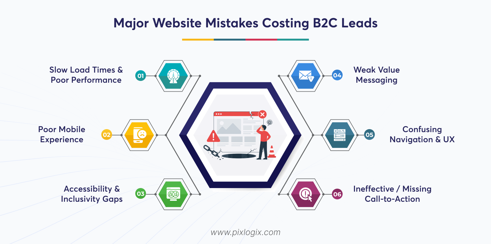
Most B2C websites don’t lose leads overnight. They lose them through preventable design and UX gaps. You must identify these website mistakes losing leads. It is the first step toward reclaiming lost revenue.
1. Slow Load Times & Poor Performance
Why it Matters:
Slow loading is one of the major website issues reducing leads. It directly impacts user engagement and conversions. Remember, even a one-second delay can cause measurable lead loss. Also, Google’s Core Web Vitals tie performance to SEO and retention.
Common Pitfalls:
- Oversized, uncompressed images.
- Excessive third‑party scripts are slowing the load.
- Ignoring Core Web Vitals benchmarks.
Fix:
- Compress and optimize images.
- Minify CSS/JS.
- Reduce server requests.
- Implement caching and CDN delivery.
2. Poor Mobile Experience
Why it Matters:
These days, 60–70% of B2C traffic comes from mobile devices. A clunky mobile interface instantly reduces conversions. Mobile website design mistakes directly influence bounce and dwell time.
Common Pitfalls:
- Buttons are too small to tap.
- CTAs are cropped or hidden on smaller screens.
- Inconsistent scroll and layout flows.
Fix:
- Conduct responsive design audits.
- Test across real mobile devices, not just emulators.
- Optimize tap targets and mobile navigation.
3. Accessibility & Inclusivity Gaps
Websites must be easy to use for visitors with disabilities. If not, they lose a significant portion of potential customers. Thus, it is essential for reach, usability, and compliance.
Conversion Barriers:
- Missing alt text.
- Poor color contrast.
- Non-keyboard-friendly navigation.
- No screen reader support.
Fix:
- Follow WCAG guidelines.
- Use accessible color schemes.
- Enable keyboard navigation.
- Add descriptive alt text.
4. Weak Value Messaging
Why it Matters:
Visitors need immediate clarity on brand relevance. Generic taglines fail to differentiate in competitive markets. These CRO mistakes on websites erode trust. Strong messaging drives action.
Common Pitfalls:
- No clear, unique value proposition.
- Homepage cluttered with random CTAs.
- Overemphasis on features instead of benefits.
Fix:
- Craft a HERO headline addressing customer pain points.
- Focus copy on benefits and outcomes.
- Align CTAs with the value proposition.
5. Confusing Navigation and UX
Why It Matters:
Navigation is the backbone of your conversion funnel. When menus are cluttered, user attention gets scattered. And scattered attention means lost leads.
Common Pitfalls:
- Overloaded menus packed with too many links.
- No clear primary path. It doesn’t guide users toward conversion.
- Hidden or competing CTAs across pages.
The Fix:
- Simplify navigation. Ensure they have fewer, focused menu options.
- Highlight one clear, primary CTA.
- Maintain consistent navigation patterns across every page.
6. Ineffective / Missing Call-to-Action
Why It Matters:
Leads don’t happen on ambiguous pages. When CTAs are unclear or generic, visitors hesitate. And hesitation kills conversions. Strong, focused CTAs improve click-through rates.
Common Pitfalls:
- Multiple CTAs competing on the same screen. This means lower conversion.
- Weak or generic button text. For example, “Submit,” “Click here”.
- Poor visual hierarchy for action prompts.
The Fix:
- Use one clear, obvious CTA per screen segment.
- Ensure a defined primary conversion goal on each page.
- A/B test button text for clarity.
Technical Mistakes That Kill Conversions
According to recent reports, pages that load in 1-2 seconds convert faster. Their reach is 3 times faster than pages that take more than 5 seconds. This highlights how technical website mistakes are losing leads. Fixing these issues is a direct business imperative. Let’s see those technical B2C website mistakes:
1. Broken Links & 404 Issues
Impact:
Broken links are real bounce triggers. When users click and land on a 404 page, most won’t try again–they leave. Dead links aren’t just simple user experience mistakes. They drain SEO value and weaken site authority.
Common Pitfalls:
- Outdated page URLs are left active.
- Removing pages without a redirect strategy.
- Ignoring regular link audits.
- Allowing internal links to point to deleted or moved content.
The Fix:
- Run regular audits.
- Implement clean 301 redirects.
- Monitor site health. Google Search Console can help you track them.
- Proactively fix crawl errors.
2. Non-existent Trust Signals
Why It Matters:
B2C buyers convert on proof. Without reviews or visible credibility markers, hesitation increases. And hesitation delays or kills the purchase decision. So, improve trust signals. They reassure users that your brand is safe.
Common Pitfalls:
- No trust signals on key pages.
- Missing security badges.
- Ignoring social proof.
The Fix
- Add verified testimonials.
- Include authentic customer reviews.
- Display security badges and clear guarantees near CTAs
- Showcase awards and certifications.
3. Data Transparency Issues
Today, users are very cautious about what they are accessing. They ensure security in each step they do. And they hesitate to convert when they don’t understand how their data is used. This is how poor transparency directly impacts trust.
Lead Killing Mistakes:
- Intrusive cookie banners.
- No visible privacy policy.
- Lack of clarity on data usage.
- No consent-driven messaging.
The Fix:
- Use clear, user-friendly cookie banners.
- Display privacy policies prominently.
- Explain data usage clearly.
- Build consent-based forms.
4. Poor Form Design
Why It Matters:
High-friction forms = abandonment.
Long, complex forms overwhelm users. It also increases drop-offs right at the conversion stage. So, include a smooth, intuitive form. It directly improves lead capture rates.
Common Pitfalls:
- Excessive required fields that feel intrusive.
- No progress indicators in multi-step forms.
- Poor mobile usability. This includes tiny fields and hard-to-click buttons.
- No auto fill or input assistance.
The Fix:
- Shorten forms to essential fields only.
- Use smart defaults.
- Enable auto fill.
- Use mobile-friendly designs.
5. Missing “Thank You” Page & Follow-Up Experience
The journey doesn’t end at conversion. Without a proper follow-up, you lose engagement. It also slowly erodes trust and upsell opportunities.
Lead Killing Mistakes:
- No confirmation page.
- No follow-up email.
- No next-step guidance.
- Dead-end experience.
The Fix:
- Create a conversion-focused Thank You page.
- Send instant confirmation emails.
- Suggest next steps. For example, explore, download, and book.
- Introduce upsell opportunities
See how a Thank You page looks and builds trust after a user completes a form here:
https://www.pixlogix.com/thank-you/
How Good Website Design Saves Leads?
A service-aligned website doesn’t just look good. It directs users to the information they are looking for. So, visitors stay engaged instead of dropping off. Intentional pathways turn passive browsing into qualified enquiries.
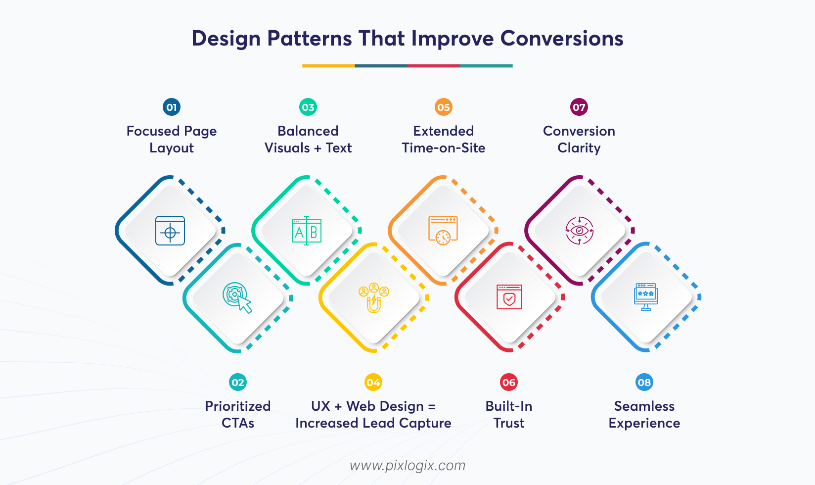
Design Patterns That Improve Conversions
Great follows structured patterns. They are rooted in user behavior. It reduces friction and builds clarity. Also, it guides attention naturally.
1. Focused Page Layout
A clean, focused layout eliminates distractions. It directs users toward the core message. Also, it ensures attention flows seamlessly to the conversion goal.
2. Prioritized CTAs
Make use of strategically placed and visually distinct CTAs. It guides users to act at the right moment.
3. Balanced Visuals + Text
Pair strong visuals with concise text. It builds emotional resonance. This balance keeps users engaged. It also reinforces trust.
4. UX + Web Design = Increased Lead Capture
Expert UX and web design improve every stage of the user journey. It helps businesses bring in more high-quality leads. This results in longer engagement and higher conversions.
5. Extended Time-on-Site
Clear pathways and engaging layouts are the key drivers. It keeps users exploring longer.
6. Built-In Trust
Professional design establishes credibility instantly. Balanced visuals also boost trust signals.
7. Conversion Clarity
Prioritized CTAs reduce friction. It guides users toward decisive action.
8. Seamless Experience
UX patterns that align with user intent boost confidence. By keeping users engaged, it reduces drop-offs.
The Takeaway: Good website design guides them with clarity toward meaningful action. Focused layouts and prioritized CTAs capture leads naturally.
Actionable Lead Rescue Checklist
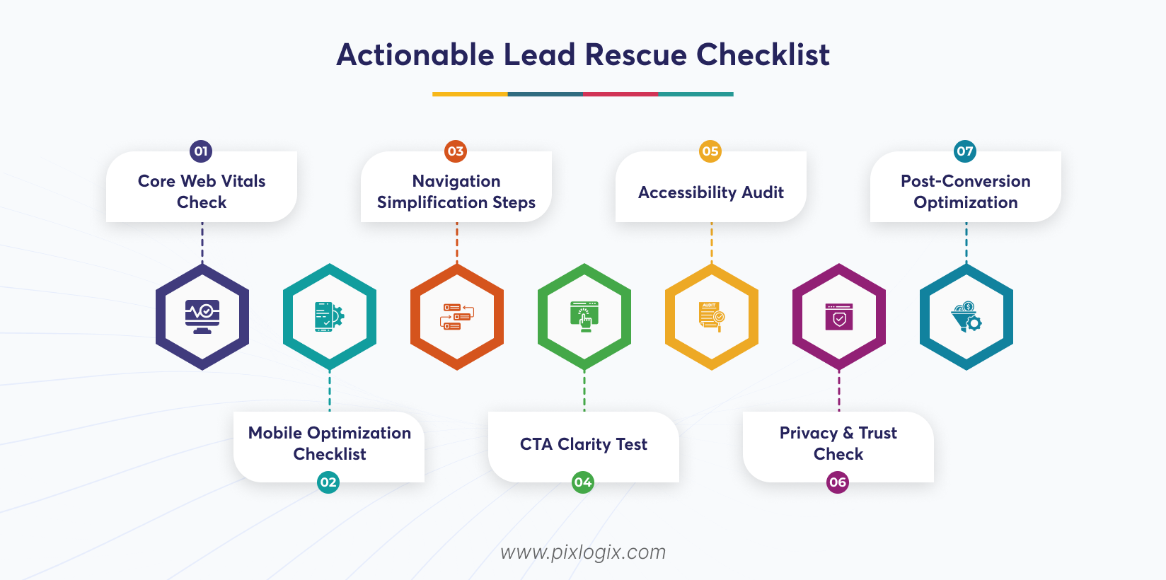
Capturing leads isn’t just about traffic. It’s about ensuring every visitor finds clarity, trust, and motivation to act. This checklist details some practical steps. It will help you rescue lost opportunities. By navigating the CRO mistakes on websites, you get the chance to maximize your conversions.
1. Core Web Vitals Check
Audit site speed, responsiveness, and visual stability. Strong site speed and stability help minimize user drop-offs. It also keeps users engaged longer.
2. Mobile Optimization Checklist
Ensure layouts adapt seamlessly. Because it is the key to improving accessibility. And it captures leads from on-the-go users.
3. Navigation Simplification Steps
Streamline menus and pathways. This helps users reach key pages in fewer clicks. Simple navigation boosts time-on-site.
4. CTA Clarity Test
Review button placement, wording, and contrast. Clear CTAs push out confusion.
5. Accessibility Audit
Ensure to follow the WCAG standards. This badge shows that anyone can access your site with ease.
6. Privacy & Trust Check
Review cookie banners. Also, check the policies and consent flows for transparency.
7. Post-Conversion Optimization
Set up Thank You pages. You can also add follow-ups to maximize lead value.
The Takeaway: Lead capture is about removing friction. Follow these proven steps for B2C website optimization. And turn your lost opportunities into measurable conversions.
Conclusion
B2C brands don’t lose leads because of poor marketing alone. They lose them through friction, confusion, and missed optimization opportunities. Not just poor UX, other mistakes also drain conversions. This includes a lack of trust, limited accessibility, and incomplete customer journeys.
But how to improve website conversions? Many ask this question, but traffic can’t fix a broken user journey alone. The brands that win are those that identify and navigate the conversion optimization mistakes at every touch point. When UX, performance, and strategy align, websites stop leaking leads. They start capturing them by fixing all the B2C website lead loss reasons. So, optimize your journey and remove friction. And make your website a consistent revenue driver.
Is your website failing to grab more leads? Then partner with a leading website design company in India, like Pixlogix. We identify your hidden UX gaps and fix all your user experience mistakes. Our experts will optimize your CTAs to create a conversion-focused design that grabs leads. Get a quote today! We’ll optimize your website to become a reliable lead generation platform.

Written by Samir Bhimbha Founder & CEO
Samir Bhimbha is the Founder & CEO of Pixlogix Infotech Pvt. Ltd. which offers web and app solutions to fulfill business's online needs and help to improve their online presence with many clients in the USA, Europe, Australia, and more. He is a skilled entrepreneur, web designer, developer, and team leader who can handle every situation. With 15+ years of experience in UX/UI design and web development, he is leading a team of IT professional talents.
Related Post

Get in Touch Now!
Have a word with our expert consultants about your next project to get suggestive guidance & proposal.
Sales Inquiry
HR Inquiry
![]() India’s First SOTD Winner on Awwwards.com – 2010
India’s First SOTD Winner on Awwwards.com – 2010