
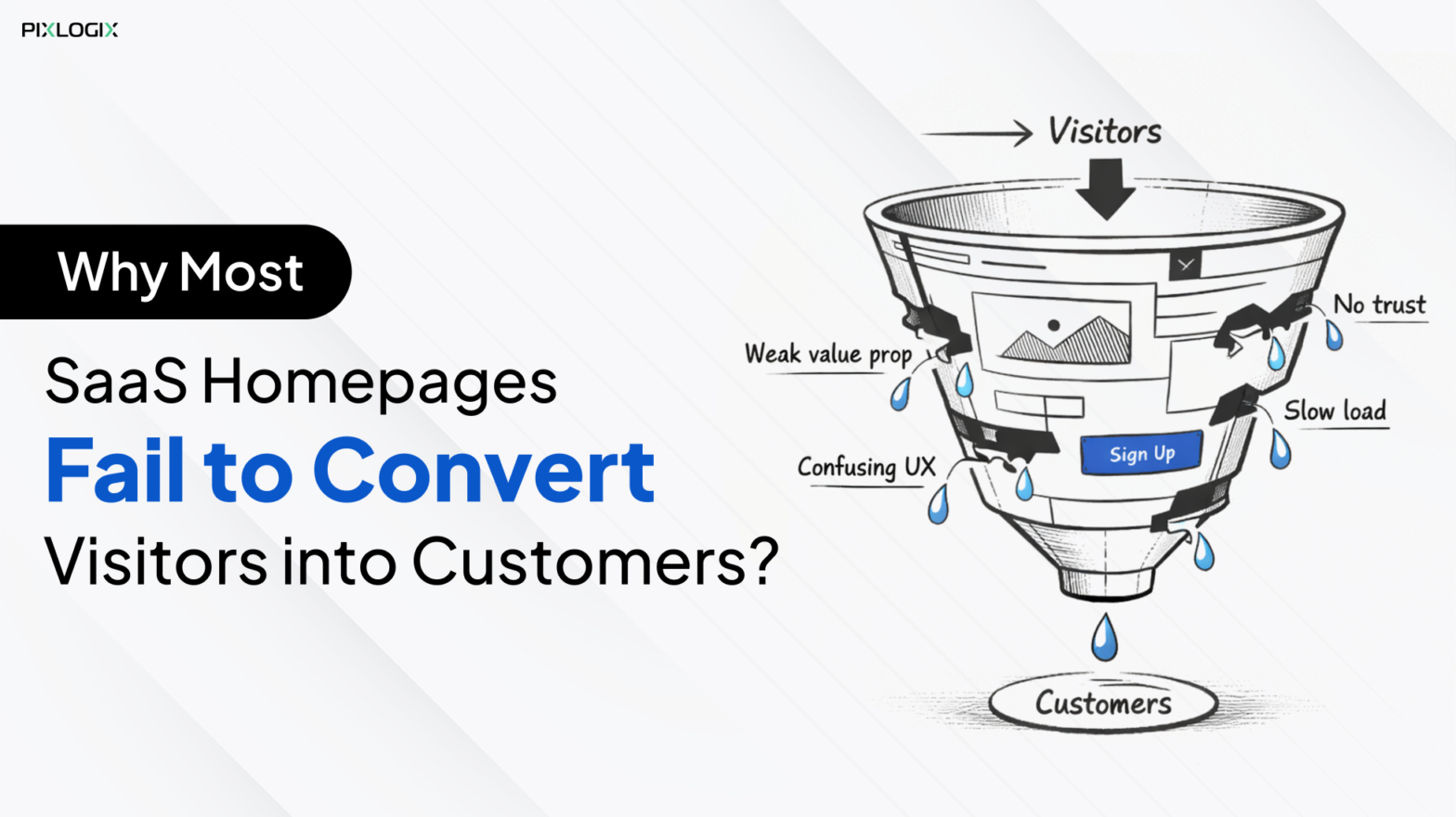
Have you ever launched a website expecting more leads? But later, you notice visitors arriving and leaving within seconds. Here, the issue isn’t your product or service. It’s your web design mistakes that silently kill your conversions.
Today’s web users are informed and highly selective. When a website fails to clearly communicate what it offers and how it helps users, visitors leave without taking action. Poor messaging, confusing layouts, and unclear value propositions are major reasons behind low conversion rates. Meanwhile, modern web design trends have fast-loading pages, clear messaging, and personalized experiences. This makes it easy to overcome the common website design mistakes. Remember, a leading web design agency in India can help you navigate this issue smoothly.
In this blog, let’s see the top 15 website design mistakes that hurt conversions. And we’ll explain how to fix them using buyer-focused design and CRO-driven strategies.
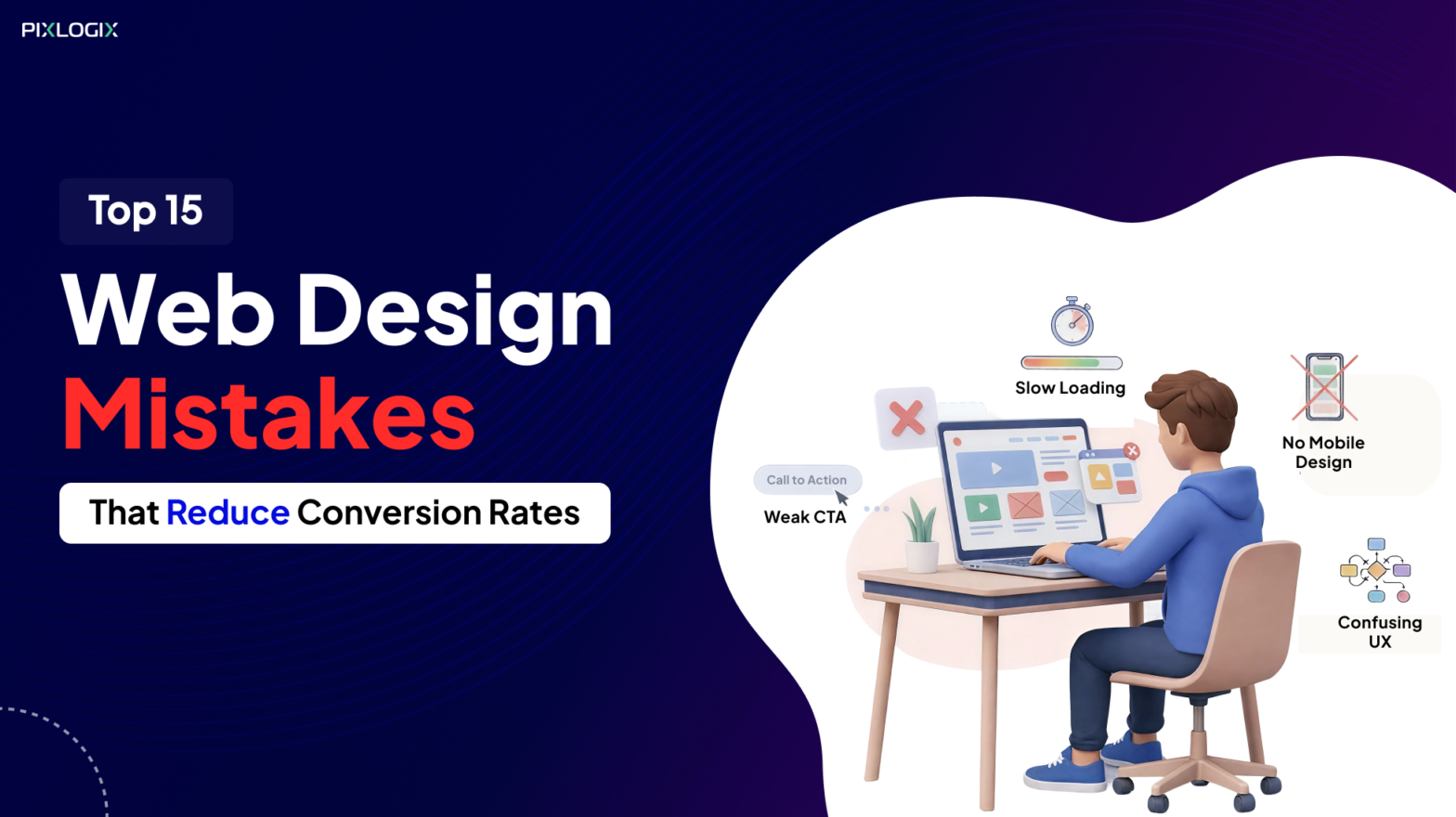
Top 15 Website Design Mistakes That Hurt Conversions

Even small design flaws can silently drive visitors away. First, find the common website design mistakes that hurt conversions. Now, fix them, which improves engagement, trust, and sales. Here are the top 15 mistakes:
1. Slow Page Loading Speed
Users often visit a site that loads fast. Any delay increases bounce rates dramatically. Google’s recent research revealed a shocking truth. 53% of mobile users immediately went away from a site, which is very slow, taking more than 3 seconds to load.
The Fix
Optimize everything for speed and UX:
- Use modern image standards like WebP or AVIF.
- Apply lazy loading.
- Bundle and compress the JavaScript and CSS files.
- Enable browser caching.
- Use CDN for consistency.
- Test performance with tools like Lighthouse.
Quick Takeaway: Slow website loading kills conversions. So, optimize your site loading speed for better conversions.
2. Poor Mobile Responsiveness
Nowadays, mobiles occupy 54% of global web traffic. Thus, ignoring them is a conversion disaster. Sites that prioritized responsive designs achieved 40% higher conversion rates. But clunky experiences created 85% cart abandonment.
The Fix
- Create mobile-first designs.
- Keep size touch targets to 44×44 pixels.
- Embrace adaptive designs.
- Test across devices.
- Use scalable grids.
Quick Takeaway: Poor mobile UX is a crucial mistake. This is one of the major reasons for low website conversion rates. This pushes users away before they even engage.
3. Confusing Navigation
Navigation is the backbone of user experience. Thus, poor navigation reduces website conversions and makes visitors leave. Hidden menus, unclear categories, and inconsistent labels are their common red flags. Webstacks recently stated that sites with poor navigation are losing more than 30% of their conversions.
The Fix:
- Organize content using pillar pages.
- Use breadcrumbs for clarity.
- Include user-friendly labels.
- Add search and filters.
- Use journey mapping tools like Nulab.
Key Takeaway: Powerful navigation builds clarity, authority, and trust.
Read Also:
4. Cluttered Layouts
The Mistake: Overloading pages with too much information
When everything competes for attention, users engage with nothing. Multiple fonts and scattered CTAs may overwhelm users. This also increases bounce rates. By leveraging the best web design services in India, businesses can fix these mistakes.
The Fix
- Apply F-pattern or Z-pattern layouts.
- Limit CTAs.
- Use white space strategically.
- Stick to two main fonts.
- Guide attention with size and colour.
Key Takeaway: Simplified designs accelerate user decisions. It also reduces drop-off between intent and action.
5. Ineffective Call-to-Actions (CTAs)
The Mistake: Clicks that demand no action.
Visitors stay away from ineffective CTAs. Hidden or vague CTAs like “Click Here” fail to guide users. Clear, visible CTAs can boost conversions by 200%+.
The Fix
- Use benefit-driven hooks like “Book a demo”.
- Make CTAs visually distinct.
- Explain what happens after the click.
- Test CTAs in headers, modals, and footers.
- Use urgency when required.
Key Takeaway: If your CTA isn’t clear, users move away. A professional web design company can help you optimize your CTA placement.
6. Inconsistent Branding
The Mistake: Contradictory design elements.
When a site uses mismatched design features, it creates confusion and erodes trust. This inconsistency makes the experience feel unprofessional.
The Fix
- Create a brand style guide.
- Standardize design choices.
- Keep spacing consistent.
- Limit the colour palette.
- Use visuals with the same style.
Key Takeaway: A cohesive design strengthens brand identity. It also improves trust and makes navigation effortless.
7. Overuse of Pop-Ups
The Mistake: Too many pop-ups.
Smartly designed signals can drive signups, trials, and leads. But irrelevant ones can hurt your search rankings. Nielsen Norman Group states aggressive pop-ups increase bounce rates by over 30%.
The Fix
- Trigger pop-ups after 70% scroll.
- Use subtle banners.
- Keep designs consistent.
- Make CTAs bold and clear.
- Ensure readability.
Key Takeaway: Thoughtful pop-ups engage users better. They’ll also help you retain them in a long run.
8. Poor Typography & Low Readability
The Mistake: Text that is hard to read.
Most of the website conversion rate problems come from poor typography. It means using fonts that are too small, decorative, or lack proper contrast.
The Fix
- Use readable fonts.
- Maintain at least 16px for body text.
- Ensure high contrast.
- Break content into short sections.
- Highlight key points.
Key Takeaway: Clear, readable text ensures users stay longer. This improves readability and trust.
9. Weak Visual Hierarchy
The Mistake: No clear focus on the page.
Poor hierarchy makes it difficult for users to find key information. Shopify highlights that stores with no clear hierarchy see lower conversion rates. Because users fail to identify those CTAs.
The Fix
- Follow a clear content structure.
- Use proper headings.
- Break content into scalable blocks.
- Highlight CTAs.
Key Takeaway: A clear structure guides users toward conversion.
10. Designing Without Understanding Buyer Persona and CRO Strategy
The Mistake: Designing without knowing your audience.
Many websites fail to convert because they are designed without a clear understanding of the target audience or buyer persona. When businesses ignore user behavior, intent, and pain points, the design fails to guide visitors toward meaningful actions.
The Fix
- Define buyer personas before designing.
- Align layouts, content, and CTAs with user intent.
- Apply CRO strategies using data and testing.
- Focus on conversion-driven design, not just visuals.
Key Takeaway: Buyer-focused and CRO-driven designs significantly improve conversion rates.
11. Neglecting Trust Signals
The Mistake: No proper indicators.
When users don’t feel safe, they leave. They find it hard to reveal their personal information or complete transactions. Baymard Institute found that 18% of U.S. shoppers abandoned a trustless cart. Because they didn’t want to share their credit card information.
The Fix
- Add trust badges near checkout and forms.
- Enable HTTPS.
- Highlight transparent policies.
- Offer visible support options.
Key Takeaway: Trust signals reassure users and drive sales.
12. Too Many Links and Distractions on Conversion Pages
The Mistake: Distracting users on goal-focused pages.
Conversion pages such as landing pages, contact forms, or sign-up pages should focus on one clear action. Adding external links, excessive navigation, or unnecessary information pulls users away from the main conversion goal.
The Fix
- Remove external and unnecessary links.
- Limit navigation options on conversion pages.
- Keep content concise and focused.
- Use a single, clear CTA.
Key Takeaway: Fewer distractions on conversion pages lead to higher conversions.
13. Confusing Checkout Process (for eCommerce sites)
The Mistake: Too many steps to buy.
A complicated or unclear checkout process is one of the common website design mistakes. It increases friction and erodes trust.
The Fix
- Offer guest checkout.
- Minimize form fields.
- Show progress indicators.
- Be transparent about upfront costs.
- Optimize for mobile.
- Use auto-fill and validation.
Key Takeaway: Make checkout fast, simple, and transparent. It increases completed purchases.
14. Weak SEO Structure
The Mistake: Poor search visibility.
Search engines often neglect sites having unstructured SEO. Ahrefs stated that 90.63% of all pages get no organic search traffic. Because they have a weak SEO structure, where most content remains invisible.
The Fix
- Use a clear heading structure
- Optimize meta tags and descriptions.
- Ensure clean, descriptive URLs.
- Improve internal linking strategy.
- Avoid duplicate content.
- Improve site speed.
Key Takeaway: Strong SEO structure improves visibility and conversions.
15. Ignoring Analytics and User Behaviour
The Mistake: Designing without insights.
Many businesses today invest heavily in design and content. But they neglect analytics and user behaviour tracking. This leads to missed opportunities.
The Fix
- Track bounce rates.
- Use heatmaps and funnels.
- Review your A/B test results regularly.
- Don’t make assumptions.
Key Takeaway: Understand how users behave and consistently track site performance. It helps you make smarter improvements for better results.
Conclusion
Your website should work as a growth engine, not a roadblock. As we’ve seen, even small web design mistakes can quietly drain conversions. From slow loading to weak CTAs, each issue affects the user journey. But you can fix these problems with the right strategy. Top enterprises take help from a professional web design company to navigate these mistakes. From improving SEO to tracking the site after launch, they’ll bring true results. Overall, create designs that users enjoy.
Looking to navigate these conversion mistakes? Then it’s time to reach a leading website design company in India like Pixlogix. Our experts will create or redesign with conversions in mind. As a custom website design company, we help you uncover and fix these hidden design flaws. Contact us today to get expert guidance for better conversions.

Written by Samir Bhimbha Founder & CEO
Samir Bhimbha is the Founder & CEO of Pixlogix Infotech Pvt. Ltd. which offers web and app solutions to fulfill business's online needs and help to improve their online presence with many clients in the USA, Europe, Australia, and more. He is a skilled entrepreneur, web designer, developer, and team leader who can handle every situation. With 15+ years of experience in UX/UI design and web development, he is leading a team of IT professional talents.
Related Post


Get in Touch Now!
Have a word with our expert consultants about your next project to get suggestive guidance & proposal.
Sales Inquiry
HR Inquiry
![]() India’s First SOTD Winner on Awwwards.com – 2010
India’s First SOTD Winner on Awwwards.com – 2010