

Why do most visitors leave your homepage without contacting you even when it looks polished? The truth is, design alone isn’t the culprit. It’s due to the poor WordPress homepage structure.
2.35% is the average website conversion rate today. HubSpot revealed this report in 2026. It also stated that top performers are achieving more than 11% by structuring user journeys strategically. That means your WordPress homepage design must match user intent. It must be organized with a clear content hierarchy and built for frictionless navigation. If not, users leave your page without exploring it.
Remember, increasing visibility alone won’t solve the conversion problem. Then, you might ask how to increase traffic to my site. The answer is: you need to clearly guide them through the decision funnel. Without a structured flow, even high-quality traffic fails to convert.
This blog explains how to design a well-structured homepage in WordPress. From ideal structure to final checklist, we’ll uncover everything. By the end, you’ll know how to turn every visitor into a qualified lead.
Why Your Homepage Structure Matters for Conversions?
Your homepage isn’t just an entry point. It’s a decision-making interface that directly impacts whether users convert or drop off. Neilson Norman Group’s 2026 UX study revealed a shocking outcome. It stated that nearly 74% of users abandon an unclear site within 10 seconds. The major reason here is poor homepage optimization.
A strong WordPress homepage structure works because it:
- Controls attention through a clear visual hierarchy.
- Communicates value instantly.
- Reduces cognitive load with progressive content flow.
- Aligns content with user intent stages.
- Minimizes friction with clear navigation paths.
The Takeaway: Structured pages improve website traffic effortlessly. With performance-driven layouts, they adapt to each user’s behavior. And transforms your homepage into a scalable, conversion-focused system.
How Visitors Navigate Your Homepage (UX Behaviour Insights)?
Visitors don’t just read your homepage. They scan with intent, filter aggressively, and act selectively. Understanding this behaviour is critical for building a conversion-focused homepage.
Key scanning patterns:
- F-Pattern Scanning: Prioritize top-left content.
- Z-Pattern Behaviour: Move diagonally across key sections.
- Layer-Cake Scanning: Jump between headings and sections.
- Element-Driven Scanning: Attention goes to CTAs, buttons, and visuals.
Keep in mind, clarity converts and complexity bills. As users operate with limited cognitive bandwidth, every additional second increases drop-off risk.
The Takeaway: To increase traffic on the site, use a structured website homepage layout. It must accelerate decision-making.
The Ideal Homepage Structure (Section-by-Section Breakdown)
A conversion-focused homepage isn’t built on intuition. It’s engineered using intent-driven sequencing and attention control. According to the 2026 HubSpot report, most websites convert only 2-3% of their traffic. It’s because of their poor structure and unclear decision pathways. Wanted to know how an ideal WordPress homepage structure looks like? Then explore these homepage UX best practices:
1. Clear Hero Section (Above the Fold)
Communicate details instantly. For example, “who you are” and “what you do”. Then, pair it with an action-driven CTA.
2. Problem + Solution Section (Hook Engagement Early)
Show users you understand their challenges. Then position your offering as the solution to build immediate relevance.
3. Services or Solutions Overview
Think of this as a decision architecture layer. Instead of listing services, structure them as modular pathways aligned with user intent. Each block should function as a micro-entry point.
4. About/Brand Introduction
Highlight experience, clients, or delivery approach. It reinforces authority early in the journey.
5. Benefits-Focused Content Section
Shift focus from features to outcomes. So, structure benefits in quantifiable or scenario-based formats. It increases perceived value and strengthens decision confidence.
6. Case Studies or Portfolio Highlights
Demonstrate real-world results over descriptive claims. Metrics outperform claims every time. For example, conversion uplift, cost reduction.
7. Secondary Call-to-Action (CTA)
Offer low-commitment actions. It’s highly suitable for users not ready to convert. For example, exploring services or viewing case studies. This maintains momentum and reduces mid-funnel drop-offs.
8. FAQ Section
Address objections proactively pricing, timelines, and process. This section should target decision-stage concerns. Structuring FAQs strategically reduces friction.
9. Contact Section / Lead Capture Form
Keep it frictionless. The goal is to minimize interaction cost with fewer fields and visible trust signals.
The Takeaway:A WordPress homepage design should not try to convert everyone the same way. It should segment intent and guide decisions.
Recommended Homepage Layout (Visual Structure Guide)
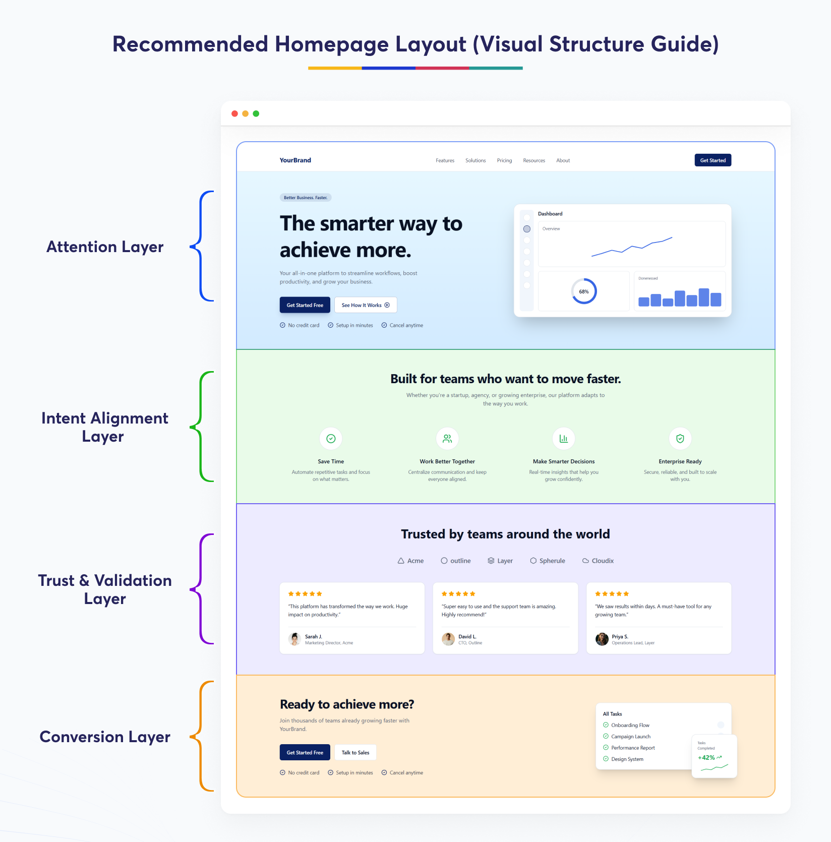
A homepage design for conversions is not just a layout. It’s an attention orchestration system designed to guide users from first impression to action.
Take a glance at these intent-driven visual sequences:
Attention Layer (Above the Fold):
Use contrast, a unique CTA. The goal is immediate clarity, explaining what you do and who it’s for.
Intent Alignment Layer:
Structure problem-solution content. And optimize services using modular, card-based layouts. This reduces cognitive load.
Trust & Validation Layer:
Include proofs like client testimonials. Add visual elements like logos and metrics. All of this reduces scepticism and reinforces credibility.
Conversion Layer:
Structure the content with clear spacing. Place FAQs, secondary CTAs, and lead forms in hierarchy. This ensures users can act without friction once intent is established.
Takeaway: Users process content progressively not all at once. Your layout should reflect that.
Real Examples of High-Converting Homepages
Now, let’s see how top brands improve website traffic at scale. Let’s explore the homepage best practices they follow:
1. HubSpot (SaaS – Conversion Architecture at Scale)
HubSpot’s homepage is built around progressive conversion paths. They use multiple CTAs to match different user intents. For example, free tools, demos, and CRM access.
2. Shopify (E-commerce – Frictionless Onboarding Model)
Shopify optimizes for speed-to-action. Its homepage minimizes interaction cost by offering an immediate “Start free trial” CTA with minimal input requirements. The layout eliminates unnecessary distractions.
3. Webflow (SaaS – Visual Hierarchy + Trust Engineering)
Webflow combines high-impact visuals with structured content flow. It uses strong visual hierarchy, interactive previews, and client logos to establish credibility early. Its homepage follows a top-down attention model.
The Takeaway: Top brands follow a structured approach. It starts from segmenting user intent and ends in reducing decision friction.
WordPress-Specific Optimization Tips
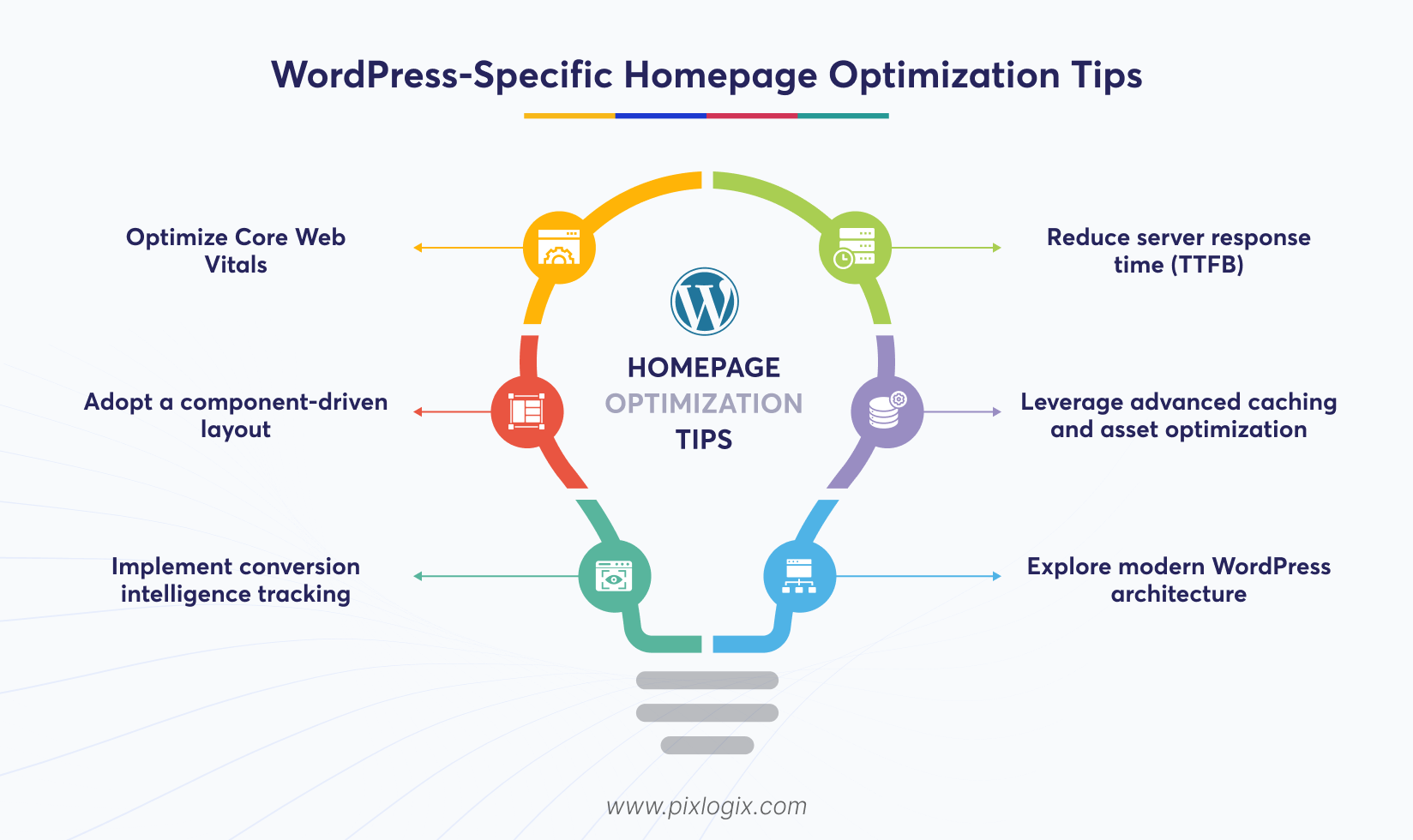
These days, homepage optimization is not just about design. It’s about engineering a conversion-focused delivery system.
Explore these business website homepage tips:
Optimize Core Web Vitals:
Focus on improving LCP, CLS, and INP. Thus, your page feels fast and stable. Reduce heavy, render-blocking elements.
Reduce server response time (TTFB):
Use managed hosting to minimize latency. Object caching and edge delivery (CDN) further reduce delay. Faster response times are also crucial.
Adopt a component-driven layout:
Use Gutenberg or Elementor to get reusable blocks. It helps you design a scalable website homepage layout.
Leverage advanced caching and asset optimization:
Implement the page caching technique. Include lazy loading and minification to streamline the rendering pipeline.
Implement conversion intelligence tracking:
Move beyond basic analytics. Track scroll depth and CTA clicks to refine your strategies.
Explore modern WordPress architecture
Decouple your frontend and backend. Use modern frameworks like headless WordPress to achieve near-instant load speeds.
The Takeaway: To drive traffic to my website, optimize them as a performance-driven system. Align speed, structure, and user behaviour with conversion goals.
Common Homepage Mistakes That Reduce Inquiries
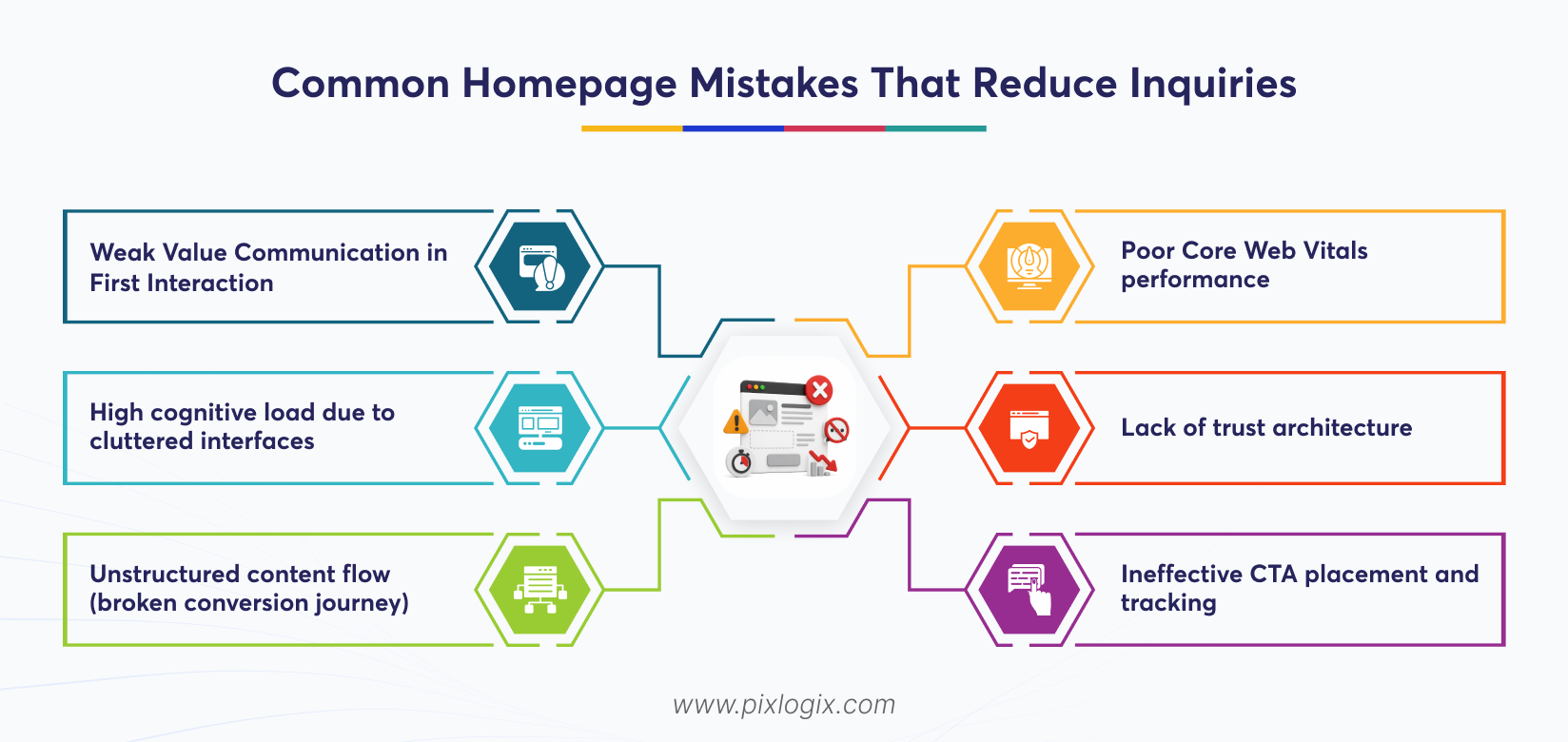
Even high-traffic websites fail to convert today. It’s because of structural, performance, and behavioral gaps.
Here are the most common mistakes that directly reduce inquiries:
1. Weak Value Communication in First Interaction
Your WordPress homepage structure should clearly communicate value. If it fails to speak within the first 3 to 5 seconds, users disengage.
2. High cognitive load due to cluttered interfaces
Overuse of sections creates attention fragmentation. Too many animations and competing CTAs further elevate this issue. It leads to drop-offs driven by decision fatigue.
3. Unstructured content flow (broken conversion journey)
Your website homepage layout shouldn’t be ineffective. Because it disrupts the natural progression from awareness and trust to action.
4. Poor Core Web Vitals performance
Heavy themes delay interaction readiness. Plugin bloat and Render-blocking scripts increase LCP and INP, which is a major issue.
5. Lack of trust architecture
Missing trust signals weaken credibility. This includes missed or poorly placed testimonials, case studies, and client logos.
6. Ineffective CTA placement and tracking
CTAs without contextual alignment or event tracking fail to convert. Without insights into funnel drop-offs, optimization becomes guesswork.
Takeaway: Homepage performance issues aren’t just design flaws. They’re system-level failures. It silently blocks conversions and reduces inquiries.
Homepage Structure Checklist (Actionable Takeaway)
Top brands prioritize validation before launching. It keeps their WordPress homepage design production-ready. Want to know how to increase traffic to my site? Explore this:
Tier 1: Must-Have (Conversion Critical)
- Your CTA must communicate above-the-fold value instantly.
- Core Web Vitals must be within threshold limits. This includes LCP<2.5s, CLS<0.1, and INP<200ms.
- Your structure should guide decision-making. Users must navigate seamlessly from problem and solution to validation and action.
Tier 2: Optimization Layer
- Ensure the attention flow and visual hierarchy of your website homepage layout.
- Check contextual CTA placement. It must align with user intent at each stage rather than being randomly placed.
- Evaluate the trust architecture. Place testimonials and case studies across decision-sensitive points.
Tier 3: Advanced (Scale & Performance)
- Ensure your site has minimized plugin bloat. Reducing the DOM size and render-blocking scripts improves performance.
- Track conversion intelligence. Check entry-level data and use these insights for iterative improvements.
- Ensure your homepage architecture is scalable. It must be built with modular components or headless/SSG approaches.
The Takeaway: Validation is the first step in reassurance. It helps you build a conversion-focused homepage that succeeds.
Conclusion
Design alone doesn’t define a great homepage anymore. It’s about building a structured, conversion-driven system. As we’ve seen, an effective WordPress homepage structure aligns with user intent perfectly. It understands user behaviour, visual hierarchy, and performance to guide visitors from first impression to inquiry. Simply trying to increase traffic on the site isn’t enough. This is why your homepage fails to convert that attention into action. So, apply strong UX insights and optimize Core Web Vitals. Structuring content around decision flow also helps businesses eliminate friction and improve outcomes.
Ready to build a high-converting inquiry engine? Then, partner with a leading WordPress development company in India, like Pixlogix. Our experts go beyond design to engineer performance, UX, and conversion systems. We offer custom WordPress development services that help us identify your hidden gaps and optimize user flow. This approach increases traffic on the site that actually converts. Get a quote today! Let’s build a homepage that delivers results.

Frequently Asked Questions
Why does homepage structure matter more than design for generating inquiries?
Homepage structure controls how users process information and take action. Without a clear hierarchy and guided flow, even visually appealing designs fail to communicate value or drive meaningful inquiries.
What are the essential elements of a high-converting WordPress homepage?
A strong homepage includes a clear hero section, problem-solution framing, structured service pathways, trust signals, and frictionless CTAs. Together, these elements guide users toward confident inquiry decisions.
How can businesses optimize their homepage to align with user behaviour?
Optimize for scanning patterns like F and Z layouts, prioritize above-the-fold clarity, and reduce cognitive load. Structured content flow ensures users quickly understand value and move toward action.
What common homepage mistakes prevent visitors from converting into inquiries?
Common issues include unclear messaging, cluttered layouts, poor performance, weak trust signals, and misplaced CTAs. These create friction, disrupt user journeys, and significantly reduce inquiry conversion rates.

Written by Samir Bhimbha Founder & CEO
Samir Bhimbha is the Founder & CEO of Pixlogix Infotech Pvt. Ltd. which offers web and app solutions to fulfill business's online needs and help to improve their online presence with many clients in the USA, Europe, Australia, and more. He is a skilled entrepreneur, web designer, developer, and team leader who can handle every situation. With 15+ years of experience in UX/UI design and web development, he is leading a team of IT professional talents.
Related Post
Top 10 Signs Your Website Needs Better UI/UX
Why Your Website Generates Traffic but No Leads
How to Build a SaaS Website Using WordPress?

Get in Touch Now!
Have a word with our expert consultants about your next project to get suggestive guidance & proposal.
Sales Inquiry


HR Inquiry
 India’s First SOTD Winner on Awwwards.com – 2010